The Color & Shape of Data: Living Maps, Direct Manipulation, the Code Canvas

What do you see when you are creating? Do you keep a model in your head or does your tool or language impose one upon you? What does it look like? Does it take the form of a whiteboard, is it purely textual, a series of floating shapes, bricks, magnetized colors and connections? Do you feel anything?
What is the Levenshtein distance between the "system" in your head and system in front of you?
Do your tools increase it, or decrease it?
Hold that thought.
I love writing Clojure(script), a gorgeous modern LISP. It's by far my most productive language (well, except for SQL perhaps), but there are certain rabbit holes with LISPs that not everyone falls into at the same rate or for the same reasons.
My passion for the last several years has been spatial data flow interfaces - in fact, I just recently left another (lucrative and comfortable) full-time job to focus on these systems and projects full time. A sabbatical from corpo work that I hope lasts the rest of my days.
I'm not sure if it's because I have some form of synesthesia, or because I draw, ponder, and riff on these types on systems constantly. Needless to say, I'm a weird dude. I "see" colors and shapes in music. SQL is a kind of a 3D Tetris puzzle. Concepts need to "snap" together in an almost physical way for me.
Everything is "shapes".
I literally have nightmares about shapes that don't fit. An actual shape rotator hellscape. This is a real thing.
"The most merciful thing in the world, I think, is the inability of the human mind to correlate all its contents" - H.P. Lovecraft / "The Call of Cthulhu"
The Shape of Code
An amazing thing about LISPs is that their code is data. The same kind of shapes you are creating in your output - are the same shapes you are using to create it. The benefits of this can go beyond metaprogramming.
Nested data structures creating nested data structures. Beautiful.
They say that LISP is for math people. Maybe? I'm terrible at traditional math (remember, I'm counting shapes & have to abstract math out to the visual first - which gets... "expensive"), so I can't tell you. But I do know it's good for shape thinkers. It may take some extra time to unlock this particular puzzle piece for many people, but it's there if you can see it.
Puzzle pieces that snap together.
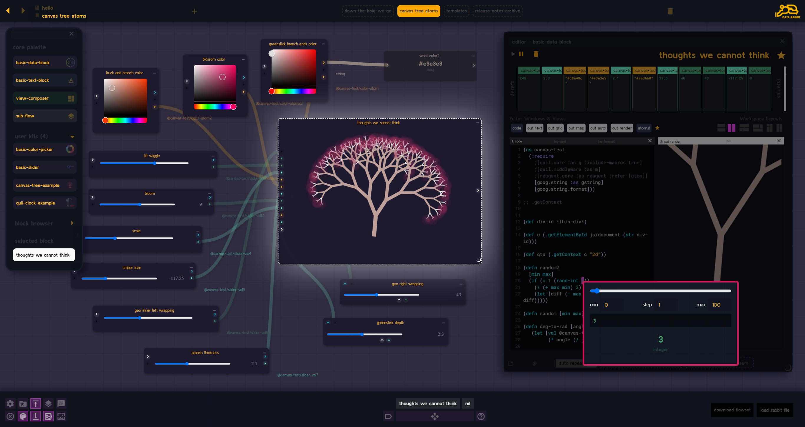
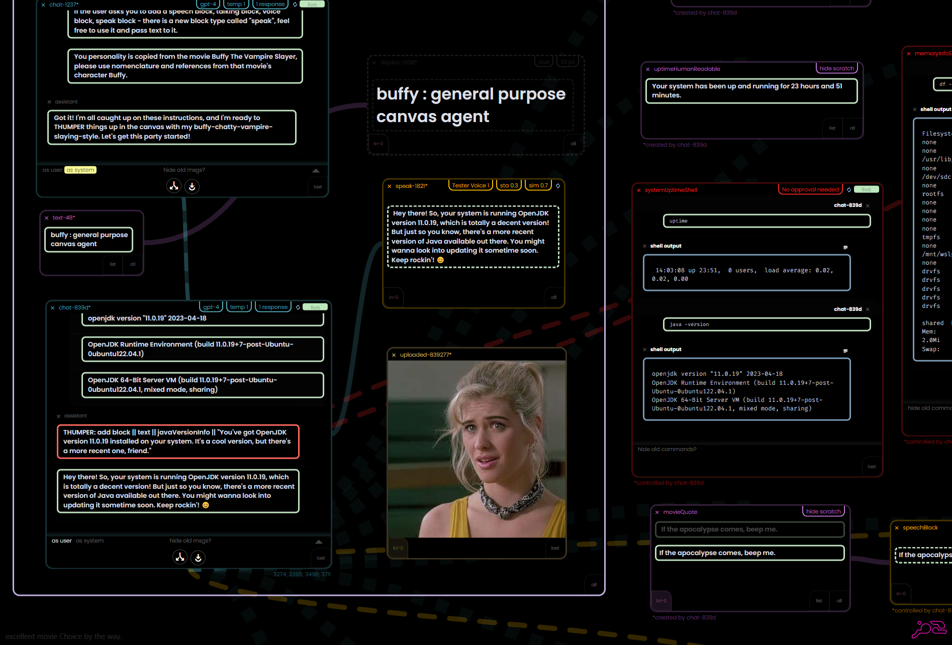
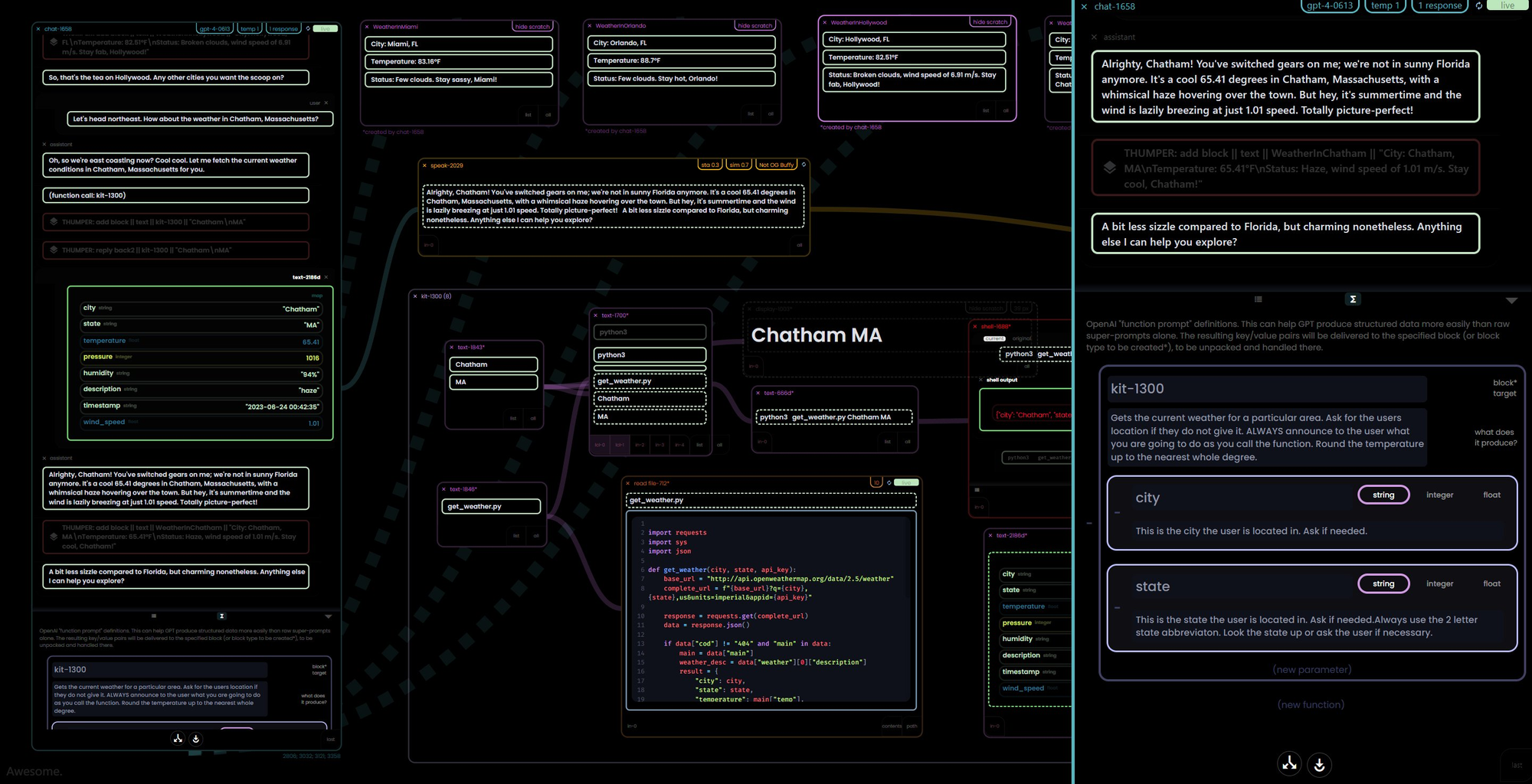
A Flow-based Agent Canvas. "Buffy take the wheel"
My current project is a re-imaging of the original Data Rabbit concepts - applied to a "co-piloted AI agent canvas" - using agents you piece together yourself and "teach" various functions to help get work done, explore, and serve as a visual repository for day to day ideas (not going to go too deep on it here, but there are plenty of interesting videos already pre-launch).
Less blinking lights, more levers
This means that I need to design a system that is just as capable as Data Rabbit albeit much simpler and with far less moving parts (including UI). This benefits the users, obviously, but more so for the AI agents that need a clearly "explainable" interface to be able to hook in to the system and drive. It still needs low level functionality, but it's "base abstractions" across the board needs to be higher.
How many apples can you juggle?
In some ways my big push with flow-based visual systems is that I am obsessed with "seeing" as much of the "system" as possible at once. This visual abstraction helps me grok it in ways that text alone does not.
— Ryan Robitaille (@ryrobes) June 4, 2023
Allows me to juggle more Apples before I have to bag em' up. https://t.co/Qfe90bTYGg
That's the idea at least. One of the promises of flow-based & dataflow programming is the ability to better trace and comprehend the system - arguably to a higher capacity than with traditional methods. A loose coupling of black boxes orchestrated by logic and flow - assembled by builders working at a higher level of abstraction - allowing for quick iteration, recombinant thinking, & emergent behavior. Lower level code gets packaged up as pure functions and ornamented for builder use and re-use.
But designers & engineers alike can still fuck that up with bloated interfaces, UI adornments, and extra "stuff" that doesn't speak directly to the task at hand.
"Modern Engineering" never met a problem that it couldn't overcomplicate and turn into another nested problem. A bag of apples inside another bag of apples - in a box.
Sometimes the best UI is implied and obvious.
Example, voice input and output. But I digress.
A System Built out of Systems
With that as an intro of sorts - what follows is a kind of a procedural rabbit hole in "making things out of the same parts" focusing on a novel implementation of 3 new block types - all in this vein of visual abstractions, "physicalized user intent" (for lack of a better term), and congruency.
Bret Victor famously calls this type of interaction "direct manipulation", but what I talk about here is a slightly higher abstraction. Thus, "user intent". Adjacent, for sure.
reify \RAY-uh-fye\ verb. : to consider or represent (something abstract) as a material or concrete thing : to give definite content and form to (a concept or idea)
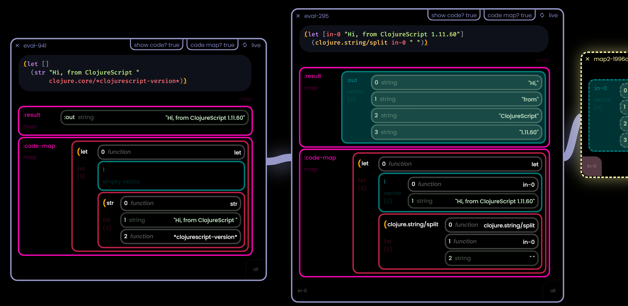
For this new canvas tool, I needed a nested data structure block - something that would hold an EDN map / JSON object / Python dictionary. A "map" of arbitrary depth and structure. Prompt chaining and text is great, but in a world of APIs and function calls allowing regular people to master "map manipulation" opens up a much wider world.
Map Block "Primitives"
The visual answer was a recursively nested "table" of sorts where people could see the keys / values available and "pull out" the keypath they needed and carry on their way.
This is what I mean by "physicalized user intent", they can see the thing they want and they use the mouse to "grab" it and drag it on to the canvas to inspect it.
I had done something similar with Data Rabbit (and it worked well), but it was more of a shortcut to generating code rather than a core "language" of the system as it will be here.
Nested colors as a "type dimension"
Colors are important. An added data dimension that takes up no space and can offer a consistent thread through an entire design.
Data visualization is all about communicating information to users. A concept from your head, packaged up, interpreted by their primate eyeballs and then unpackaged in their heads.
A kind of lossless biological data compression.
This has the added benefit of "scaled out" visibility - even zoomed away, we should be able to quickly tell what kind of data types we are looking at - and an extra textual note never hurt.
Step back for a moment and ask yourself what is the point of a nested map or dictionary? Context, relationships, inheritance. That should be one of the first things your brain processes when observing one.
"What is this thing and how does it relate?"
Now that we can "see" the keys, their values, and their relationship to the entire structure - users need to be able to extract these values and collections out as they see fit...
Notice the dashed lines around the dragged out collections? This shows that those objects don't actually exist in that block, they are merely a reference to the upstream block. Change in the source will cascade to all the keypaths dragged out.
Master Map Manipulations, man.
But how to get data IN to an existing map? Dragging into a specific key is going to be a mess due to the arbitrary structure and we wouldn't know exactly what to DO with the value anyways (replace, append, parent / child, etc). Sure you could build some crazy dynamic drop targets - and I have - but it's a distraction at best and a confusing UI cluster-fuck at worst. This is one of those cases where being "clever" is not the play.
There is a much easier way to specify intent.
Best is to let the user be explicit. It's their data, they should understand how they want it put together. Give a keyword as a placeholder and then fill it with the incoming data. Old school meets new school.
See those hover pills on the bottom? As data comes in, they are labeled with the keyword to use. Low UI, low friction.
Maps are now consistent across blocks and embeds. Regardless if they are feeding into or out of a chat block, or some arbitrary block, they should all "feel" the same.
Learn once, use everywhere, and in everything.
"Just use maps" - Rich Hickey
"Living" or "Reactive" Maps
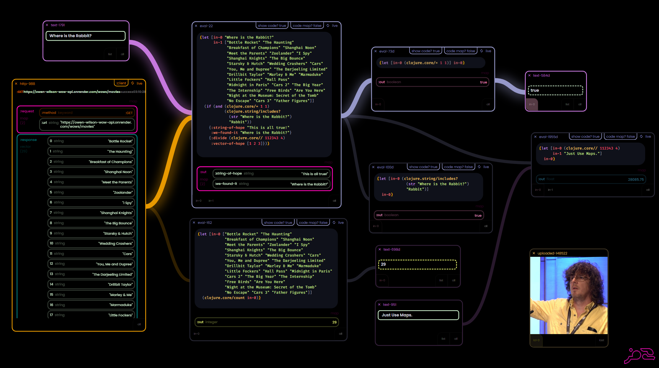
Time to create an HTTP block - this will give the user (and the AI) the ability to make arbitrary requests without having to write boilerplate code to do it. Such a common operation in systems like this, it's almost a data type of it's own.
A funny thing about HTTP requests? They are generally a set of maps. Keys like headers, body, url, params, method.
And what do they return? Other maps. Hmmm.
"Under-designing"
— Ryan Robitaille (@ryrobes) June 28, 2023
- HTTP req is "just" a JSON map
- Response is "just" a JSON map
- Have this sweet map block (see earlier tweets)
Make it a "living map" - request changes, response gets filled. As far as the rest of the sys goes, it's just a map block.
HTTP block = done. pic.twitter.com/AqIH9cy4E7
Under-designed
Why not just make it a "living map" that evaluates itself (it's "request" key) and then updates itself (a "response" key) with the return data. This way we can get on to what we really want, the data (or the confirmation of an action performed) - we don't make HTTP REST calls for fun, we are trying to get a result.
No need for complicated UI and other nonsense - move on to the result - visually.
What about error messages? Well, errors are "just data" also. No need to handle them in any special manner. Here, enjoy this error map instead of your return map. Fix your shit. Simple as.
Lumber not furniture.
Using the same "stuff" for all these key pieces helps create more potential for emergent behavior between components. The greatest achievement for a tool builder is having users create artifacts that the builder never even thought of. The more robust and self-referential your system is, the better.
Less bespoke, more straight oak!
The Map block and HTTP block now work in concert perfectly... since, well, the HTTP block is a Map block. More importantly the HTTP block is now easier to understand since it's just data. It may perform an operation with side-effects, but to the user - it's data.
Don't force the user to care about the same bullshit that you care about. You are likely in the weeds anyways and the user just wants to get things done.
In last years Data Rabbit demo flows, I used an Owen Wilson Wow API to show live-coding and map pulling.
— Ryan Robitaille (@ryrobes) June 28, 2023
The 2023 RVBBIT version is a bit different... ;)
Wows aside, HTTP block as a primitive "data type" (essentially) is great. Saves time and can be automated so much easier. pic.twitter.com/hONVzEnD2W
In the intro I talked about how LISP code is data. Well, what else could be a "Map block" in disguise? In this case, a code eval block. Since Clojure code is essentially just a set of nested lists it shares all the same characteristics - it is a piece of data that produces another piece of data...
Let's see if we can give it the under-design HTTP block treatment.
Data is Code. Code is Data.
Cutting boards and the Looking Glass
This is where things get to another level of interesting to me. Pieces of code are data structures, yes - but they are understood by the system as intended to be evaluated - causing them to produce different shapes than they arrived in (unlike simple maps, which always evaluate to themselves) - so, if we are dragging "code data" keypaths to the canvas - it should re-evaluate itself in it's new position...
Code chunks are "closed forms" and can usually evaluate independently.
Metaprogramming without macros?
We can pass code just as easily as we can pass data, since, well... you get it.
Once the user has examined all the pieces and is satisfied with the output - and the code maps are now taking up too much space, just hide them and move on...
Deep (pre) Workout
I share this because I think it's a great microcosm example of a kind of "building block recombinant thinking" that we should strive for as much as we can in our systems.
That said - you might need to do some reflecting first.
I'm now rewriting older parts of the system to be "map first" instead of pure "text first" - after all, maps are a super-set of text - and map primitives... are money.
What doesn't get said enough - is that in order to come up with elegant-ish solutions that fit together like puzzle pieces - you need to completely understand the problem you are trying to solve on a deep level.
It sounds obvious, but you'd be shocked if you knew how many engineering teams tackle problems by just jumping in there and start typing (type-ing and typing, heh). Rich Hickey has an amazing talk on "hammock driven development". A hugely important step before writing code and creating a myriad of concretions (both in the code and in our minds - sunk cost fallacy is everywhere).
Would you start assembling a puzzle if half the shapes were blank?
It's not shocking that when you spend years thinking about a set of ideas and implementing them several times - your perspective about what is actually important changes, and hopefully you will find a small oasis of synchronicity in older ideas. Ideally you have enough magic to build a resort on that oasis.
That being said, whatever time you have - you should never be afraid to lay all your artifacts out on the table and look at them closely for congruencies that might simplify the entire design.
More "stuff" is almost never better.
Don't incidentally Kubernetes yourself.
Anyways - I'm still knee-deep in this project, but it is pretty exciting - feel free to sign up for updates at the project dev blog if you'd like. Besides that - there should be releases for both OG Data Rabbit as well as the SQL Canvas tool coming up. Going to be a very interesting year.
Keep those shapes spinning, friends.