Quick "Hackathon" Release - Tableau Flow Maps
Something that has always bugged me - is its ability to create a very unique form of opaque cascading spaghetti logic - due to the nature of it's interaction systems. Let's try and make it more "observable"...

Hey, I'm alive. It's been a bit too long since I've posted here, but 2022 was an amazingly productive and eventful year...
- finally released Data Rabbit Alpha(s) (which has gotten a great response so far and I'm looking forward to some big things 2023 with it)
- gave a talk about Rabbit at reClojure 2022 (awesome crew there)
- started working on a smaller Rabbit-inspired spin-off (an "inverted" dashboarding tool called CanvaSQL, coming out soon)
- took control of my health, got (more) fit, finally quit drinking...
It's been.... quite a year. More on all that soon, I'm working on a 2022 retrospective and will go into depth on those topics (c'mon, it's really an excuse to talk about all things Rabbit).
This post is about a quick < 2 week side project I undertook in order to clear my head from some of the other side projects that have been kicking around (CanvaSQL was a break from Rabbit dev, and this was a break from CanvaSQL dev, lol) as well as address something that had been vexing me in my day job toolchain...
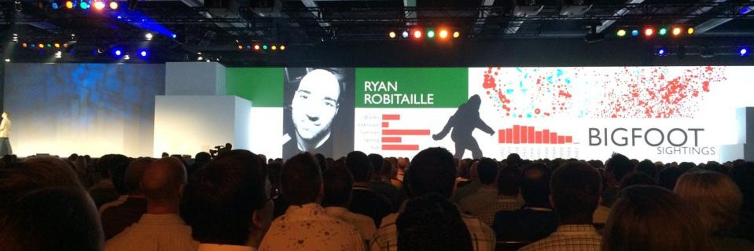
Tableau. Love it or hate it, it's a thing.
A pretty damn useful thing actually. I have a long history with it and the company, but that's a story for another day...
Cost concerns and recent BigCo ownership drama aside, it can get you very far in terms of Business Intelligence Reporting. Easy to learn, a high ceiling to master, and you can build a great many divergent and impressive things with it.
But that kind of flexibility has some trade-offs.
Something that has always bugged me, but I could never quite put my finger on it, is it's ability to create a very unique form of exceedingly opaque cascading spaghetti logic - due to the nature of it's user facing interaction systems and how they weave together.
Let's take a look at these 3 "systems" real quick so I can explain myself...
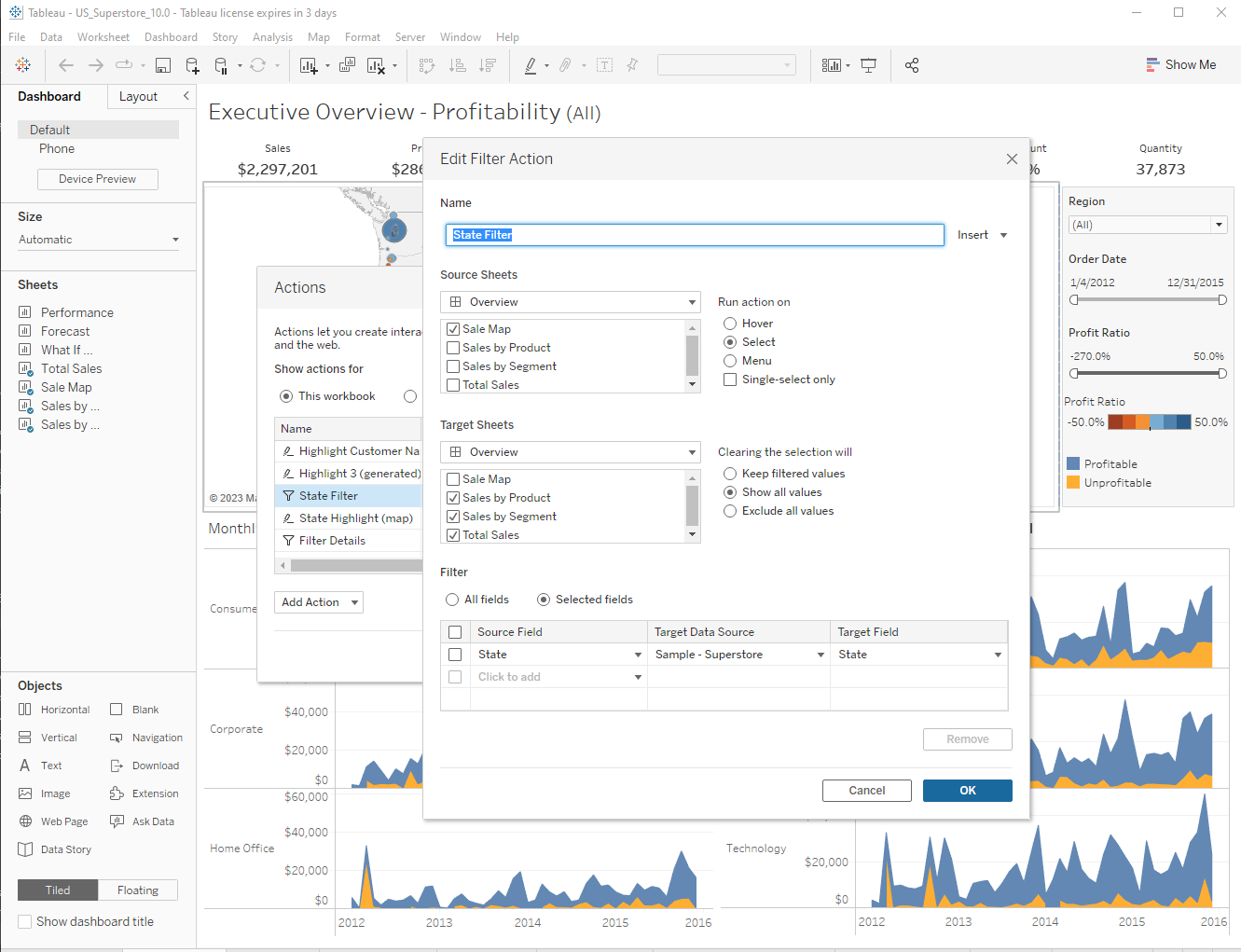
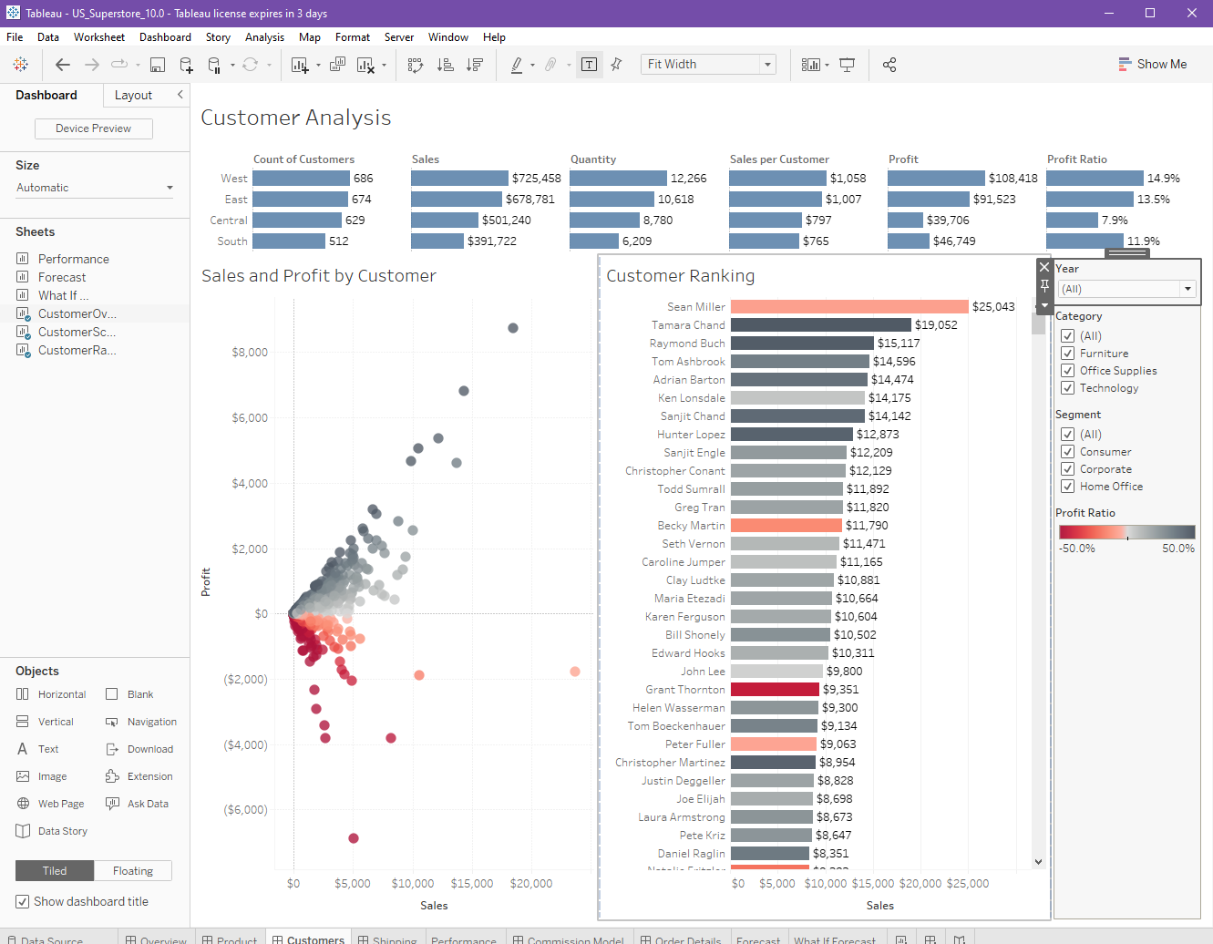
Dashboard actions
Dashboard actions allow you to make any graph/widget (worksheets in Tableau speak) an event source for an arbitrary number of other worksheets.
This is actually pretty awesome and makes creating context action / intuitive feeling UI designs super easy. i.e. User clicks on the bar for "North America Region" you can then filter everything else to only show "North America" Sales data, etc.
**It's implemented with regular boring UI dialog boxes and not any kind of cool interactive "direct manipulation" style like I would try and design - but I'm getting off topic...
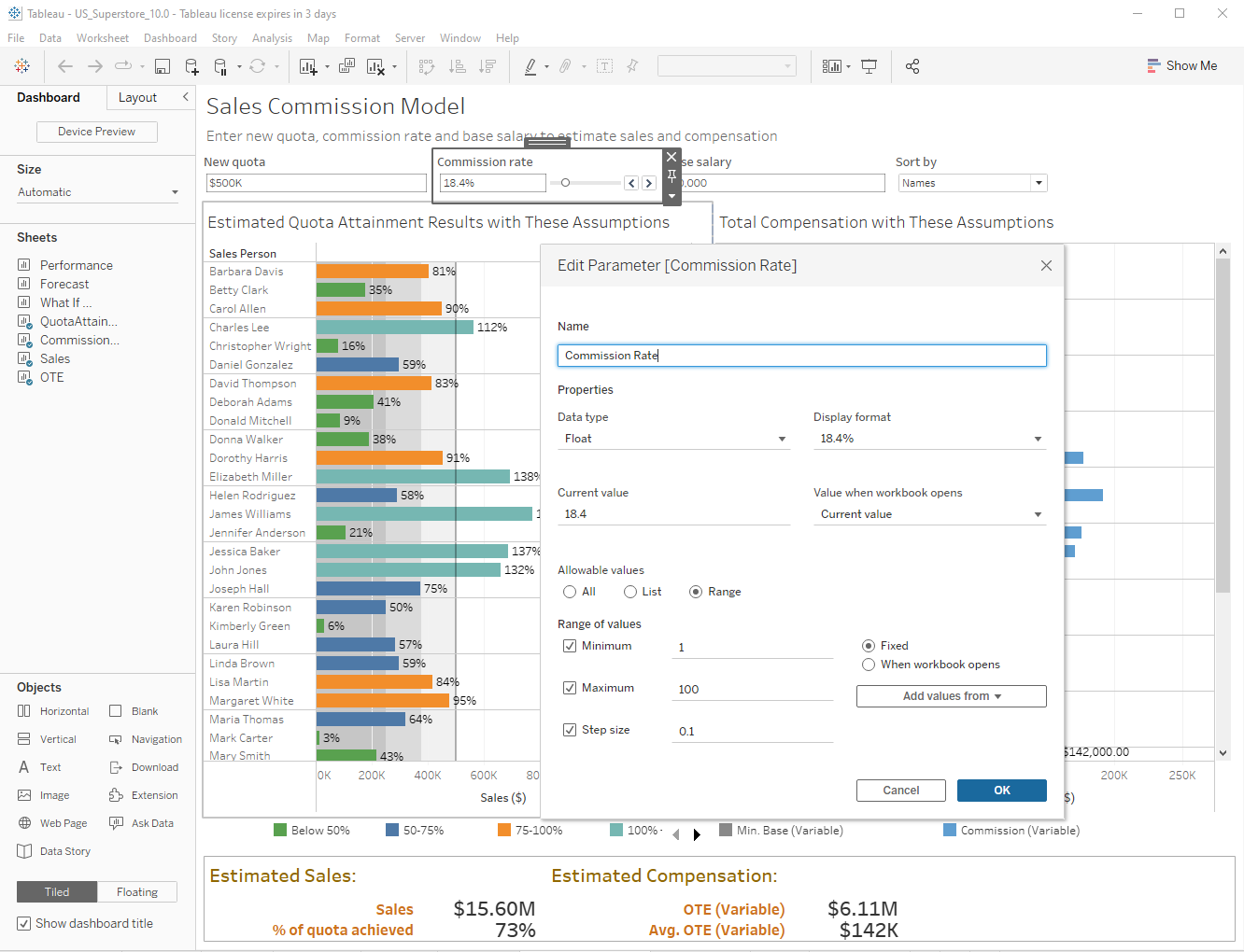
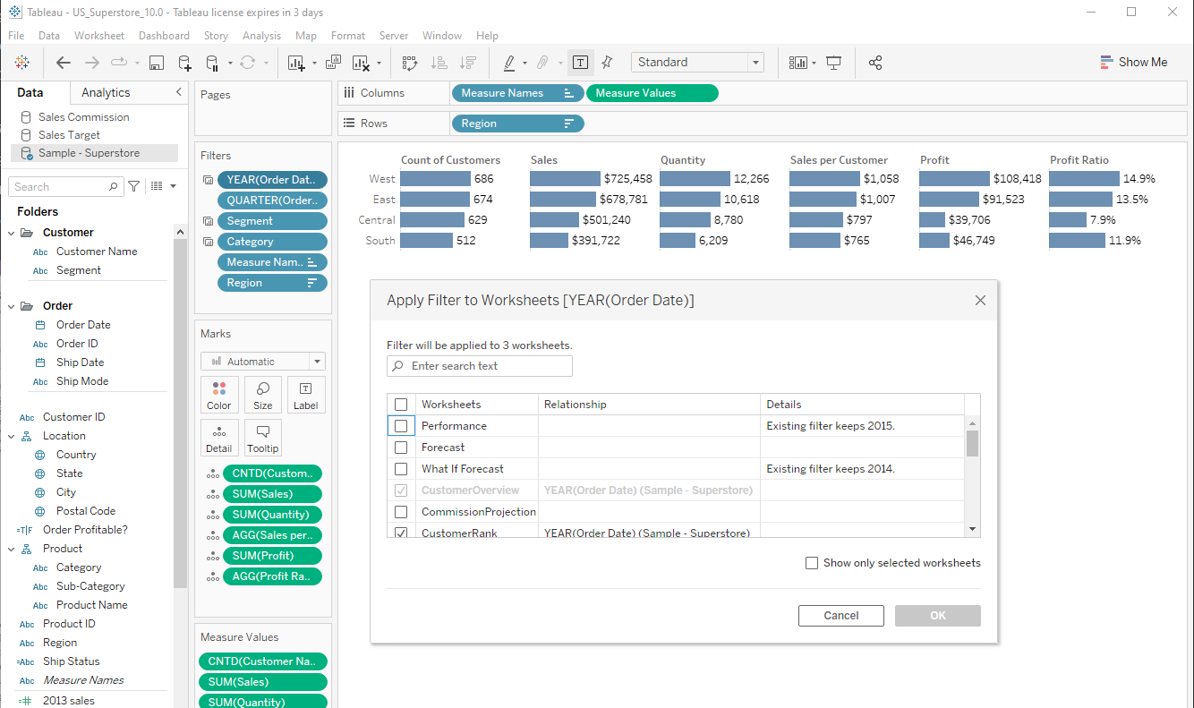
Parameter Mutation
Another lever that you have are your disposal for user interactions is via Parameters (which are essentially global variables). Commonly (in these scenarios) they are:
- Presented as a hardcoded UI input dialog to the user (free form text, drop-down, radio button, etc) - interacting with this input changes the parameter in turn executing any Tableau calculations that use it.
- Via a special Dashboard action that takes the worksheet input and instead of sending it to other worksheets as a filter or a conditional highlight - will mutate a specific parameter with the specified field value - this in turn causes a cascading execution of any logic that users it like above.
Individual Worksheet Filters on a dashboard
Last but not least we have worksheet filters. But unlike Dashboard Action Filters we talked about above - they are unconcerned with the context of the dashboard and it's contents.
Worksheet filters can be for single worksheets, multiple worksheets, entire data sources, or all linked data sources - and none of this has anything to do with the dashboard itself. The dashboard is merely a container here and the logic is elsewhere.
Ok, now that we've got that out of they way - I'm sure you can smell the punchline from a mile away...
Your Dashboard Logic - Now Fully "Complected"!
These 3 interwoven systems provide the dashboard creator a flexible palette to craft the data-interactive user experience of their dreams, no? Well, kind of - but possibly at the cost of braiding all those things together accidentally.
In a complex dashboard - the problem is that we now have several systems with direct AND indirect actions (of the 1st and 2nd orders) occurring - that for all intents and purposes need to be reasoned about in the developers head in order to keep them straight. This is the only place the holistic interaction model really exists.
This can be compounded when coming back to a dashboard after many months to fix a bug, make a change - or maybe even transferring ownership over to someone else. Explaining the "action cascade chain" in a document can be arduous and not as useful as you'd think. They almost have to step through all the objects and unpack them in their head to "see" it.
Cognitive Overhead Tech Debt or Incidental Complexity?
Zooming out - there is no easy way inside Tableau to see these relationships all at once. Which ones cascade into others, which ones clash, etc. Not to mention asking "What If" questions, like:
"If my user interacts with Worksheet X on dashboard Y show me ALL the relevant things that happen behind the scenes"
I spent some time sketching out how I could make this kind of logic more "observable" in a small UI viewer. Which is always a cool exercise - because it forces you to ask the question:
"Well, what is actually important?"
A question which is much more enlightening than a laundry list of things that you want to surface. Mission oriented, so to speak.
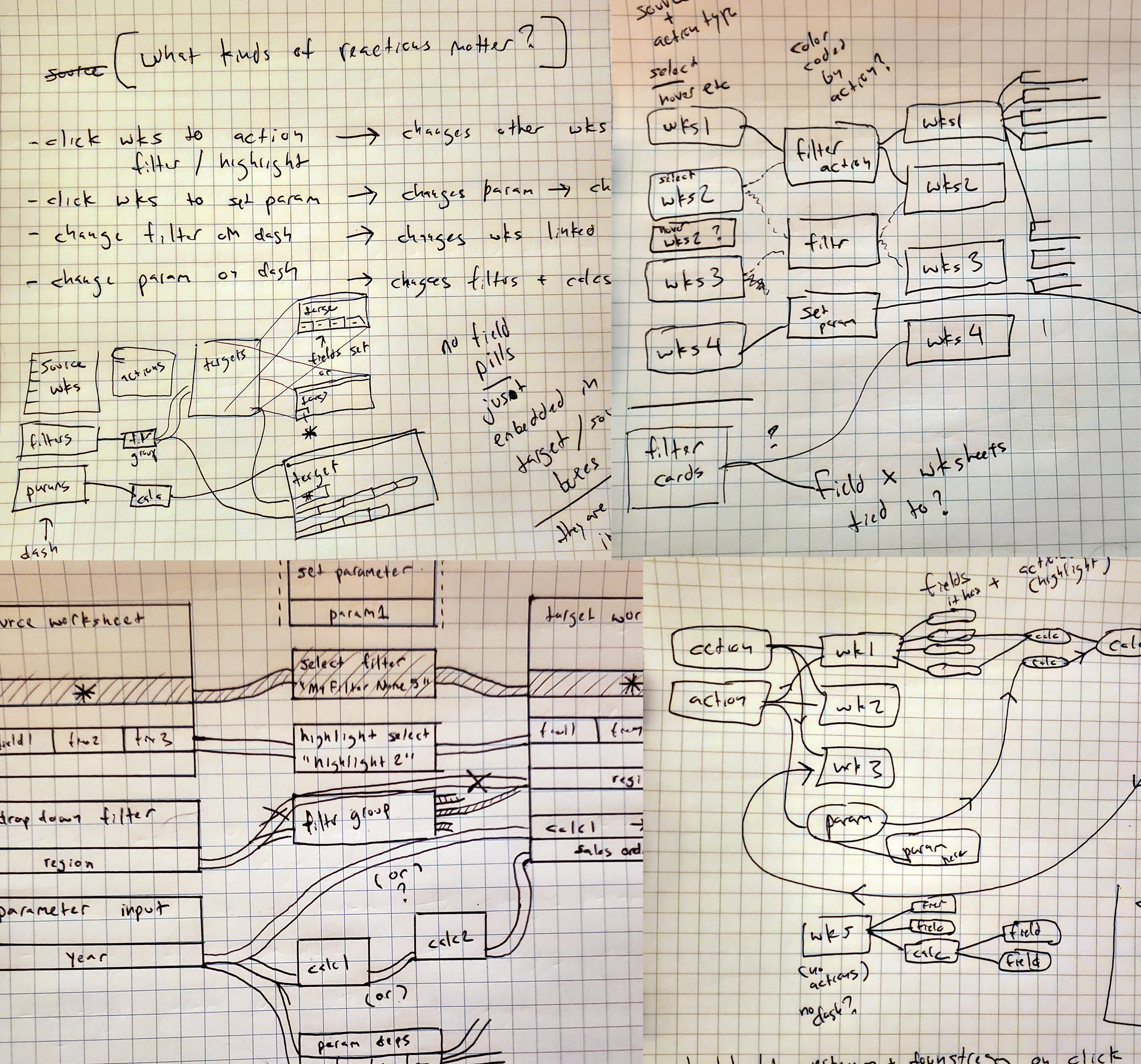
Lots of graph paper and Clojure later...
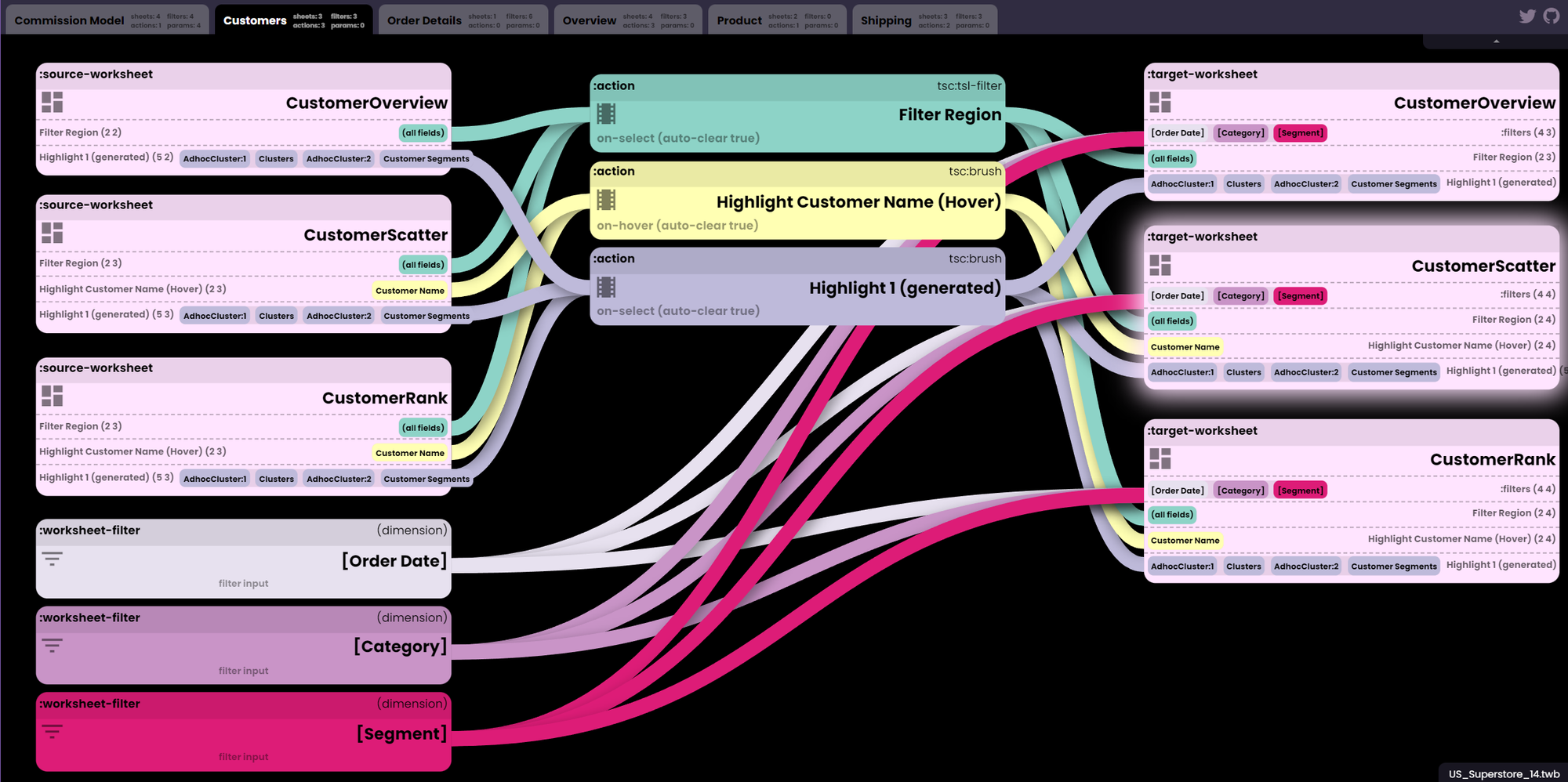
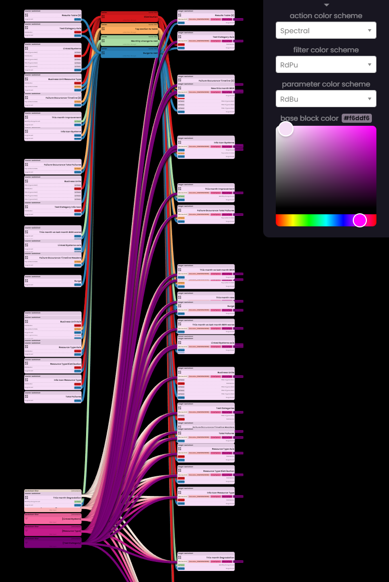
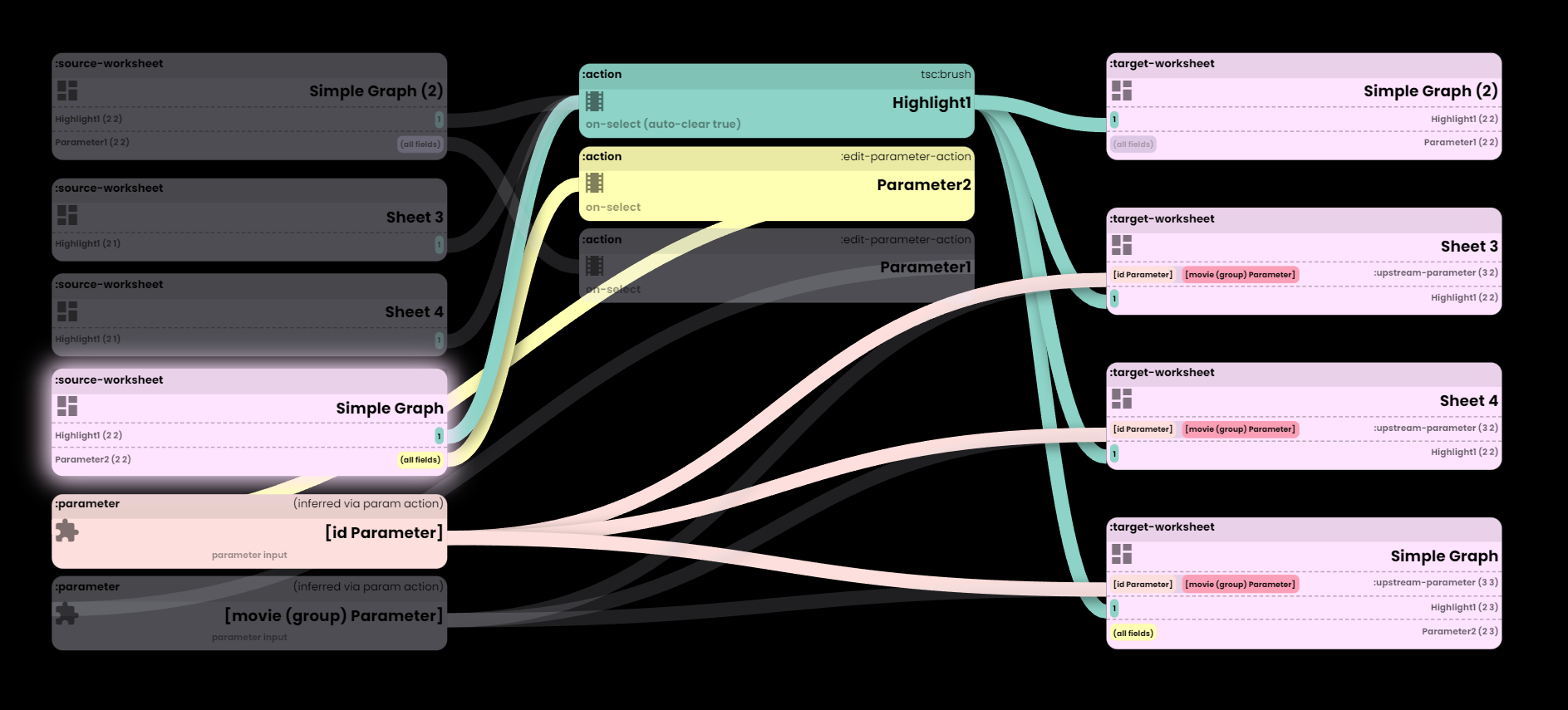
Enter the "Tableau Flow Maps" viewer...
After that large prelude / problem statement, I almost don't even have to explain what it does. Ah ha!
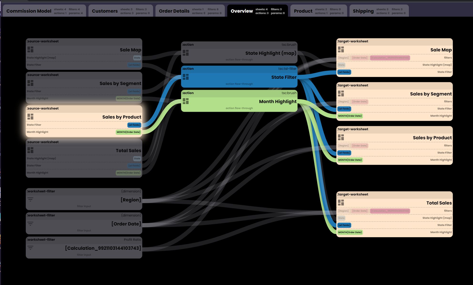
It reads in your Tableau workbook file (not the packaged TWBX archive, just the base TWB file) and presents one flow map for each dashboard. It's a fairly simple "boxes and lines" style UI that is all about relationships.
There are 3 columns:
- Inputs - source worksheets, filter widgets, parameters (ones used explicitly and implicitly via parameter actions)
- Actions - the literal configured dashboard actions that some of these reactions flow through / were created by
- Outputs - the target worksheets on the dashboard that react to the inputs
Clicking on any of the boxes will show upstream and downstream items involved (including indirect / implied ones - which are probably the most invisible ones in the native Tableau UI).
#Tableau Flow Maps: a "Dashboard Action Visualizer" - releasing on monday (hosted ver, self-hosting binary, and Clojure(script) source).
— Ryan Robitaille (@ryrobes) February 4, 2023
Fun little tool I whipped up to try and better understand dashboard interactivity. Drag in a TWB file - get an interactive flow map. pic.twitter.com/IvUkNsjPC5
Give it a try with your Tableau TWB files here, or run it locally from the release binary (JAR file).