Screenception & Hoverzilla. Can a deeply flexible layout builder still be sane and understandable?
The search for balance between flexibility and control - can we do it without making things too much of a absolute pizdiec in the process?

The search for balance between flexibility and control - without making things too much of a absolute pizdiec in the process.
I recently "finished" (as if) the bulk of the MVP layout builder for Alpha 0 and wanted to take a minute to talk about it and how it relates to my Data Rabbit core design pillars from my earlier Rabbit intro post. Might not be interesting for everyone - but I've found that exercises like this can be super helpful as things iterate out to infinity. Think of it as an undo/redo log of my thought process.
TLDR: Did a quick video also if that's more your style. Check it out. I neglect to mention this in the video, but everything is built on React (if it wasn't obvious).
Disclaimer: I've been building on/with tools like this for a very long time and I feel like I've seen it all, hacked it all, made things dance that weren't supposed to, broken them badly, etc. Part of what Data Rabbit is is a highly opinionated way of building data apps; hence, my opinion in these waters is heavy and flows like fine Nilfgaardian ale.
Anyways - let's see how this feature lines up to the core ideas.
Keep things data-centric
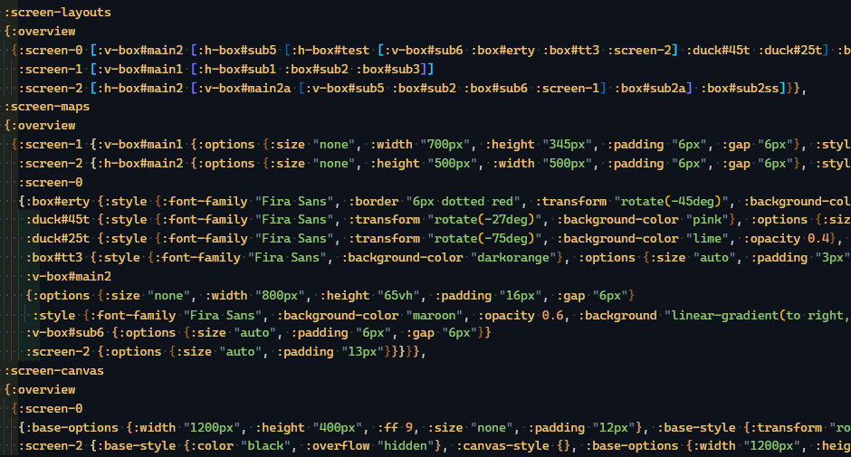
Yes. It is literally all maps and vectors. Tiny learning curve for those who don't know what those are (or might refer to them as dicts, arrays etc). I like to think of the interface as a portal for populating data maps - those maps combined are basically a DSL for the entire user-built application (in Data Rabbit terms - a "kit").
Don't hide or abstract complexity - make it understandable instead
Having an entire system built on data maps can get mess fast - so the UI and the maps need to work together to communicate to the user what is going on and how they relate to each other. I used to tell people in dashboard design classes that each interaction should always strive to do what the user would expect it to do - and I'm trying to follow that logic here (see hover select).
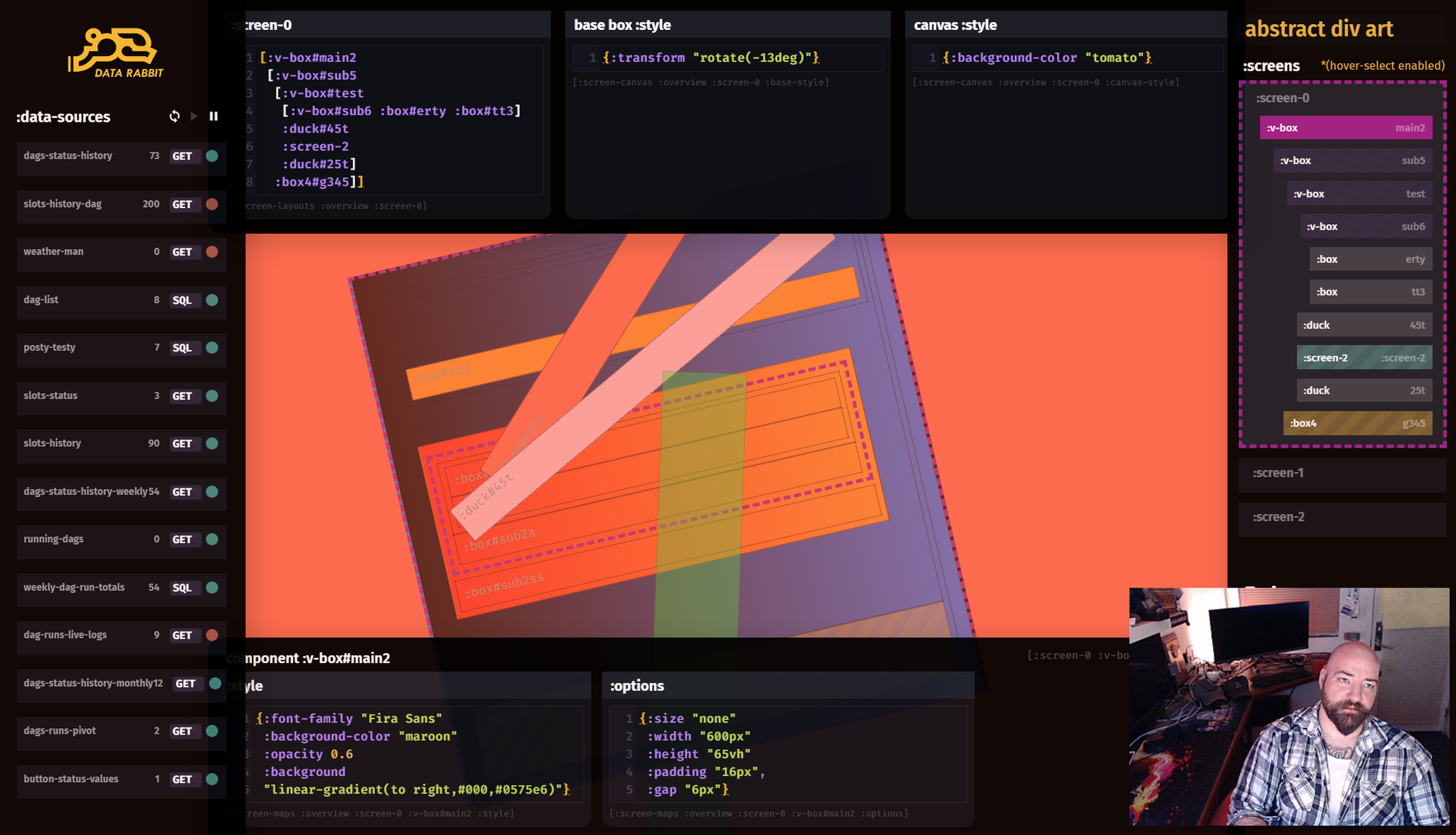
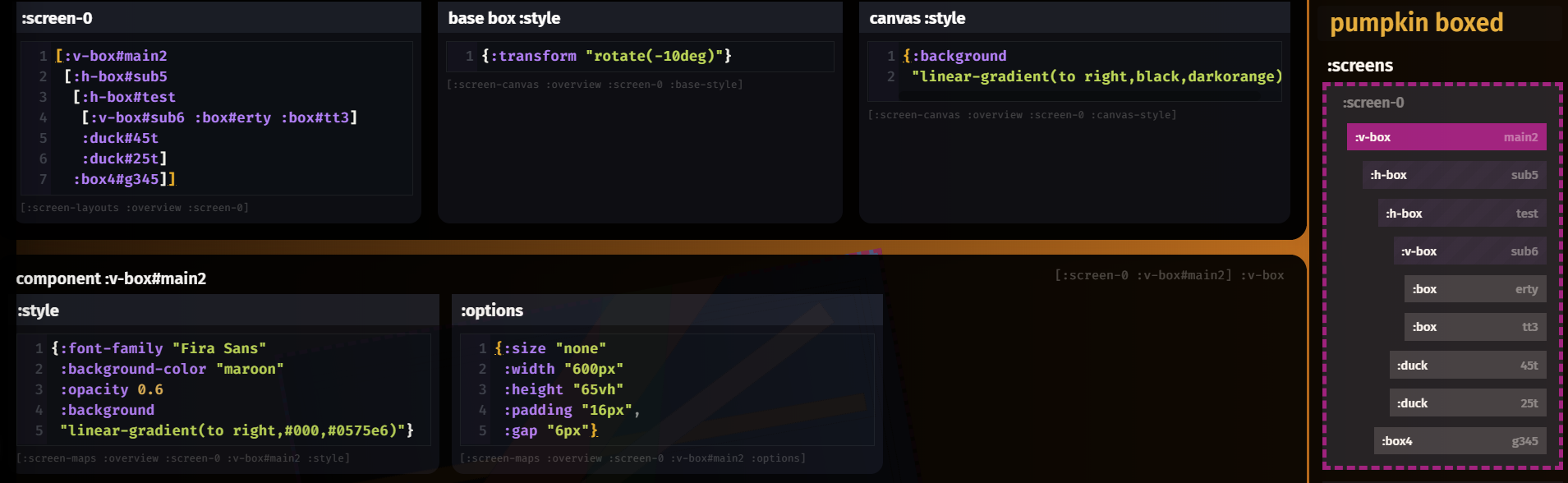
Changes to CSS maps or the flexbox layout (as a simple nested vector) immediately changes the rendered screen, hoping to foster that direct connection between code and shapes. Easier to understand, easier to learn.
This isn't quite good enough - the user needs a bit more cues. Similar to Bret Victor's famous "Inventing on Principal" talk - there should be more bi-directional understanding between the code and the picture, so to speak.
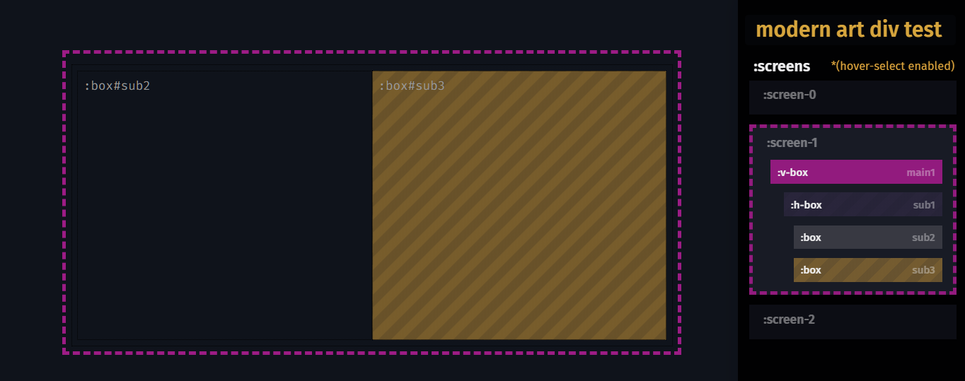
In hover-select mode (key held down) - when the user mouses over the actual rendered elements (our flexbox screen containers) they light up - as well as their corresponding box in the "hierarchy" view. This is great for maintaining a better direct mental model between the code and the shapes themselves (plus it's a handy way to select a box to edit it).
Not only that - but hovering on the hierarchy view will highlight the rendered elements also - trying to close that mental gap between a nested group of vectors (which can get hairy) and how it will render.
Understandable Complexity. Gonna put that on a shirt and when someone sees it and says "What the fuck does that mean?", I'm going to nod my head and say "Exactly".
Keep the editor UI as simple as possible
Selfishly, a lot of this is to keep things fast (both in React performance as well as dev iteration time) - it's too early to dig deep into some complex model that might not work out well at the edges - after all, do we even need all that in an interface?
Besides, the artifact is the most important part.
The editor is just a shovel.
Complex UIs tend to be obsessed with "number of results per click action", which makes things "easy" for some, but generally not "simple". In fact, this usually requires a lot more abstractions and shielding the user from the nasty bits (think about something like Tableau with "magic" operations).
Everything here is made of the same stuff. No hiding.
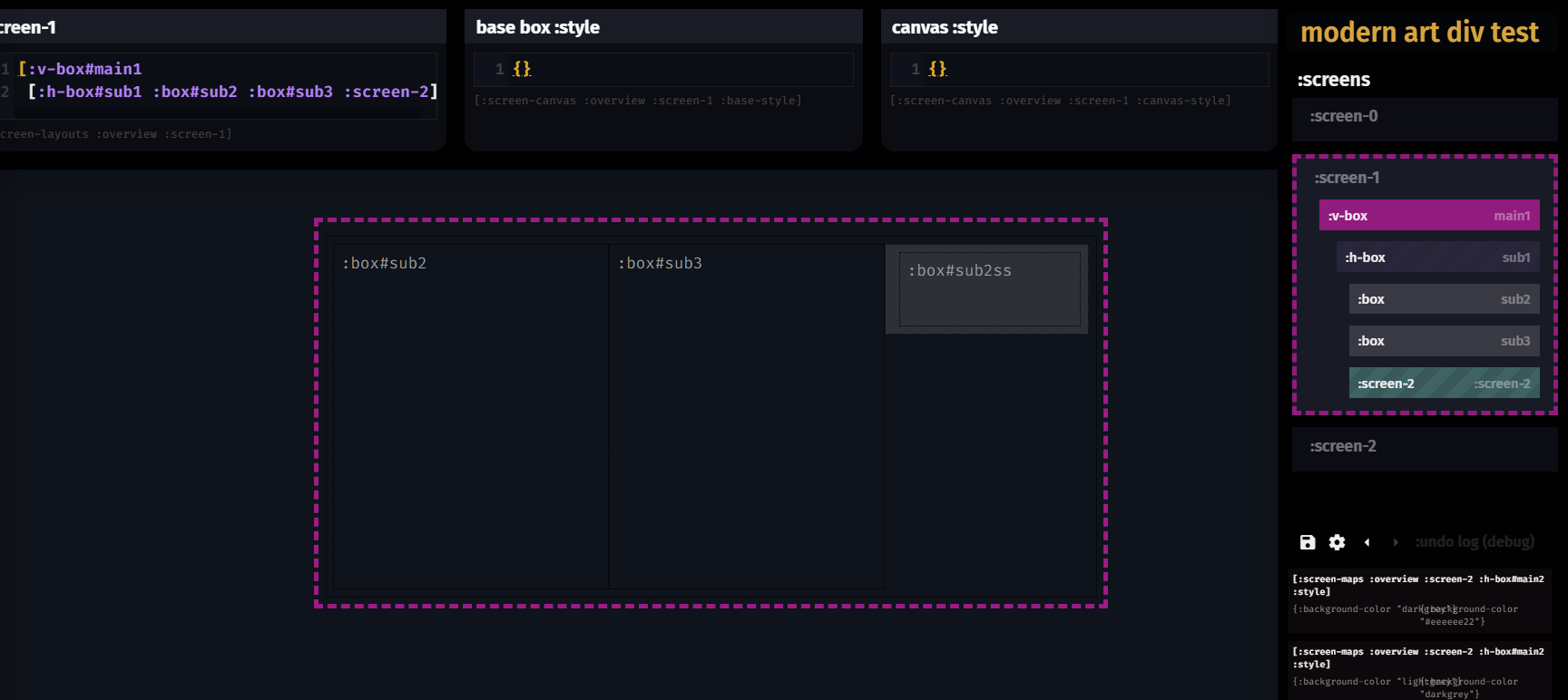
The entire layout model is composed of "screens" - and that means that screens can be made out of other screens, which adds some basic modularity help to complex layouts. The editor treats this just like any other box, it just lets you know that it is a screen. Simple - and more importantly, it works in a way a user might expect.
For layout building, a simple blocky "map symphony" type editor approach seems to work well. We shall see how it ages.
Stay close to the metal
Again, for a multitude of reasons - I've been careful to not abstract things away and create some weird pseudo language in the process. The layout vectors are 95% what they'd look like in CLJS, the layout options are straight from the component library (with more on the way), and CSS is well... literally just CSS in EDN form.
I don't expect users to jump ship and start writing ClojureScript - but it is nice to know that they would be learning something more than some niche application interface language.
At the very least - they will learn CSS quickly (and in-app helpers can make that way less painful in the future).
Have a high "creative ceiling", be "hackable"
Free-form flexbox and CSS is a very high level of creative flexibility and we are only a thin layer over that. That's a pretty high bar. Can users get into trouble? Of course, but they can hopefully visually see what happened and can always undo themselves out of trouble. Which, as I mentioned, is a great learning tool.